Responsive websites respond to their environment
Adaptive (Multiple Fixed Width Layouts)
or
Responsive (Multiple Fluid Grid Layouts)
Mixed Approach
Fixed width for large and medium.
Fluid width for small.
Why?
“Day by day, the number of devices, platforms,
and browsers that need to work with your site grows.
Responsive web design represents a fundamental shift
in how we’ll build websites for the decade to come.”
- Jeffrey Veen
Small + Medium + Large
One site for every screen.
Who Is Doing It?
Not just demos, design shops and vanity pages. Real client work.
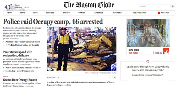
The Boston Globe
Largest responsive web design project to date
bostonglobe.com
Grey Goose
Responsive site for Grey Goose with parallax scrolling animation
www.greygoose.com
Barack Obama
The Obama campaign continues to be at the leading edge of web technology.
barackobama.com
When To Use It?
Things to Consider
- Time & Money
- Browser Support
- Performance
- Content
- Website vs. Web App
How?
“Stop Thinking in Pages. Start Thinking in Systems.”
- Jeremy Keith
Frameworks (save time)
or
Roll Your Own (more control)
Best Practices
- Content Check
- Start Small (Mobile First)
- Exit Photoshop, Enter Browser
- Make It Modular
- Always Be Optimizing
- *Best practices still emerging!
Where Can We
Learn More?